Sunday, August 10, 2008

Standardized Choropleth Map


A Standardized Choropleth map illustrates data that has been areally averaged. The shadings in this map show how many people there are per square kilometer worldwide.


Lorenz Curve


A Lorenz Curve is a type of a graph. It plots all of the variable against the frequency of the distribution of the variable.

Parallel Coordinate Graph

This is a Parallel Coordinate Graph. It represents multiple variables analyzed from the minimum to the maximum. They are useful in scientific uses such as meteorology and medical research.


http://raffy.ch/blog/parallel.jpg

Friday, August 8, 2008

Index Value Plot

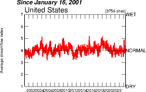
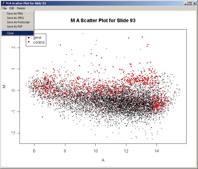
This index value plot depicts the average streamflow index for eight years for the United States. Being graphed along the normal range shows the fluctuation for the streamflow variable.


Population Profile Map

A Population Profile is a type of map that shows the change of demographics over years. It may look like a histogram, but it can have breaks between the data. It also shows multiple variables, such as men and women.

Climagraph

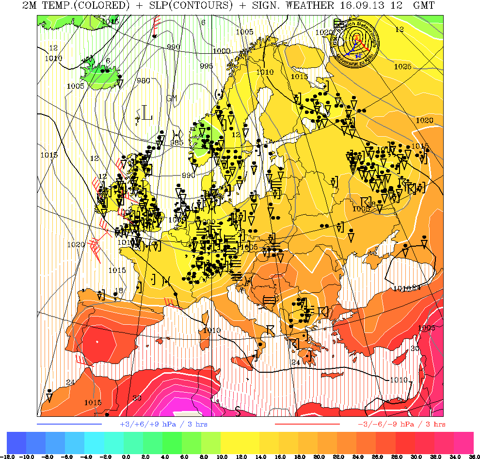
A Climagraph is a map graph that charts temperature and precipitation from month to month. This climagraph records a full year's data for Walgett, Australia. We can determine that the driest month was July.

Windrose


The image to the left is a mental map I had when I first thought of the word Windrose. Beautiful as it is, it is not able to tell the wind speed or wind direction for a specific location. The one above is able to do that!

Triangular Plot

A Triangular is a type of graph that shows three variables. The one below shows the relationships between three political philosophies (parties) and how they voted.

Histogram


A histogram is a statistical representation of data. Each range of the variable is recorded and shaded in that there are no empty spaces.


http://www.graphicsserver.com/SampleApps/DotNet/General/Chart%20Types/Custom%20Charts/Histogram/Histogram.png

Unstandardized Choropleth Map


This Unstandardized Choropleth map represents vacancies by zip code for an area. It is considered unstandardized, because it has not been areally averaged.

Bilateral Graph Map


This Bilateral Graph map shows more than one variable being displayed. The legend shows which agency is involved, and which resources are managed by whom.


http://www.creativemappingsolutions.com/maps/thematic/thematic_map_1-web.jpg

Nominal Area Choropleth Map


This is a Nominal Area Choropleth map. The data being represented is nominal, meaning this map of the world shows the Gross Domestic Product for different nations. The amount of the GDP is defined by color shades.


Univariate Choropleth Maps


This is a Univariate Choropleth Map. This type of map allows for one type of variable. It shows each state's most prominent minority group.

Bivariate Choropleth Maps


A Bivariate Choropleth Map is one that has more than one variable being represented. In addition to the colors showing differences in poverty levels, there is a "Continental Poverty Divide as well. It shows where the poverty is more densly located.

Box Plot


A Box Plot is a type of statistical map. It is able to define data from the lowest measure to the highest one. It is able to display the data more objectively than others, reducing implications that are sometimes "read into" data.


Stem and Leaf Plot


A stem and leaf plot is a statistical way to display real numbers. In the display above, it analyzes the ages of family members at a reunion by age. The stem is the 10s holder. For example, there are three family members in their thirties, one aged 32, one aged 34, and one aged 37.http://www.eduplace.com/math/mhm/5/06a/ts_5_6a_wi-1.gif Someone needs to tell this tree to relax!


Similarity Matrix

A Similarity Matrix is a type of map system that records the analysis of data that is similar. In the example below, there are not very many similarities in the variables because the variables have few overlaps.


Coorelation Matrix


A Coorelation Matrix is a type of map often used to analyze data. It shows the relationships of strength and direction between two random variables.


Star Plot


This is a star plot. It is used to represent data with multiple variables. The images represent different "layers", and it makes possible the ability to see where layers overlap in this example.

Star plot http://www.humble-inc.com/app99-2-fig8.jpg

Scatter Plot


A Scatter Plot is a graph map. It is used to determine if there is a relationship between a set of variables.


Unclassed Choropleth Map

This is an example of an Unclassed Choropleth Map. It represents population, with one shade representing a greater number than the other. It might be confusing to some because it implies that a set amount of people live in each of the counties represented with their boundaries.


Classed Choropleth Maps

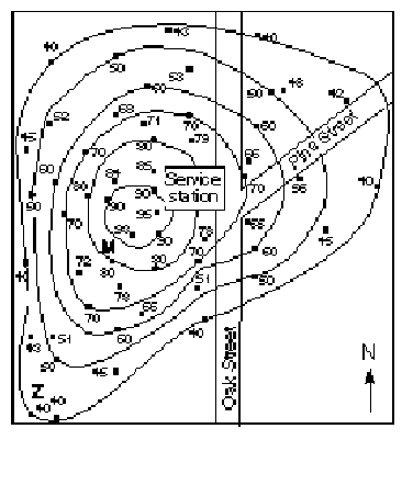
This classed choropleth map shows data by color. Each color represents change in the variable.


Range Graded Proportional Circle Map


This is a Range Graded Proportional Circle Map. It uses circles to represent data. There are a set amount of circles used in this type of map.

Continuously Variable Proportional Circle Map

This map of Canada's provinces and territories is an example of the map style known as a Continuously Variable Proportional Circle Map. This tpe of a map uses a circle to show data rather than small dots. The bigger the circle, the bigger the variable.


DOQQ (Digital Orthographic Quarter Quads)


DOQQ stands for Digital Orthographic Quarter Quads. A DOQQ map is the result of combining aerial photography and traditional mapmaking geometrics. A DOQQ map removes the distortion often found in aerial photographs. Landmarks found on the map are realistic representations as a result of the photography, rather than an idealized version.

DEM (Digital Elevation Models)

A DEM, or Digital Elevation Model, demonstrates three dimensional images, and can use color to represent relief. It is a digital file, and each pixel represents a 30 x30 meter area.


DLG (Digital Line Graphics)

DGL, or Digital Line Graphics, are maps that are able to hold many types of information about the area depicted. It can represent topography, borders, and highways. DLGs are digital vector data. The data is stored as lines, points and areas.


Hypsometric

Hypsometric maps illustrate the three dimensions with contours and shading. This is a beautiful example that can be found at the link below:


DRG (Digital Raster Graphics)


The map to the right shows an example of DRG, or Digital Raster Graphics. The image was digitally scanned in order to make the image. A raster is grid data, and each pixel is identified by longitude and latitude.

http://wvgis.wvu.edu/graphics/browsegraphics/drg.jpg


Cartographic Animation


Cartographic animation is a map format that is used to track patterns of change. Notice the water moving onto land. This can be activated by clicking onto the link below.

Thursday, August 7, 2008

Doppler


Doppler gives us a microwave signal of returned echoes from selected locations, and the radial velocity is measured. The process benefits mankind not in simply map making efficiency, but with weather forecasting, and is beneficial in the medical world. Dopplers are used for the imaging of fetuses, and also used to locate and monitor blood circulation for certain patients.

Isopleths


The lines of an isopleth map connect areas that have similar values to the variable. This one is especially nice because colors have been included to define the differences as well. They have a theme such as rainfall or drought.

http://www.meteoschweiz.admin.ch/web/en/climate/global_climate_monitoring/GAW_CH_Allg/GAWozone/Umkehr.Par.0004.Image.gif

Isohyets

This image is not a monster, it is a map with lines known as isohyets. Isohyets are used to demonstrate rainfall on a map.


Isotachs

Isotachs are lines on a map that are used to display wind speed. The colors on this map also imply movement.

Isobars


Isobars are lines on a map that show contour. Isobars represent air pressure on maps.


LIDAR

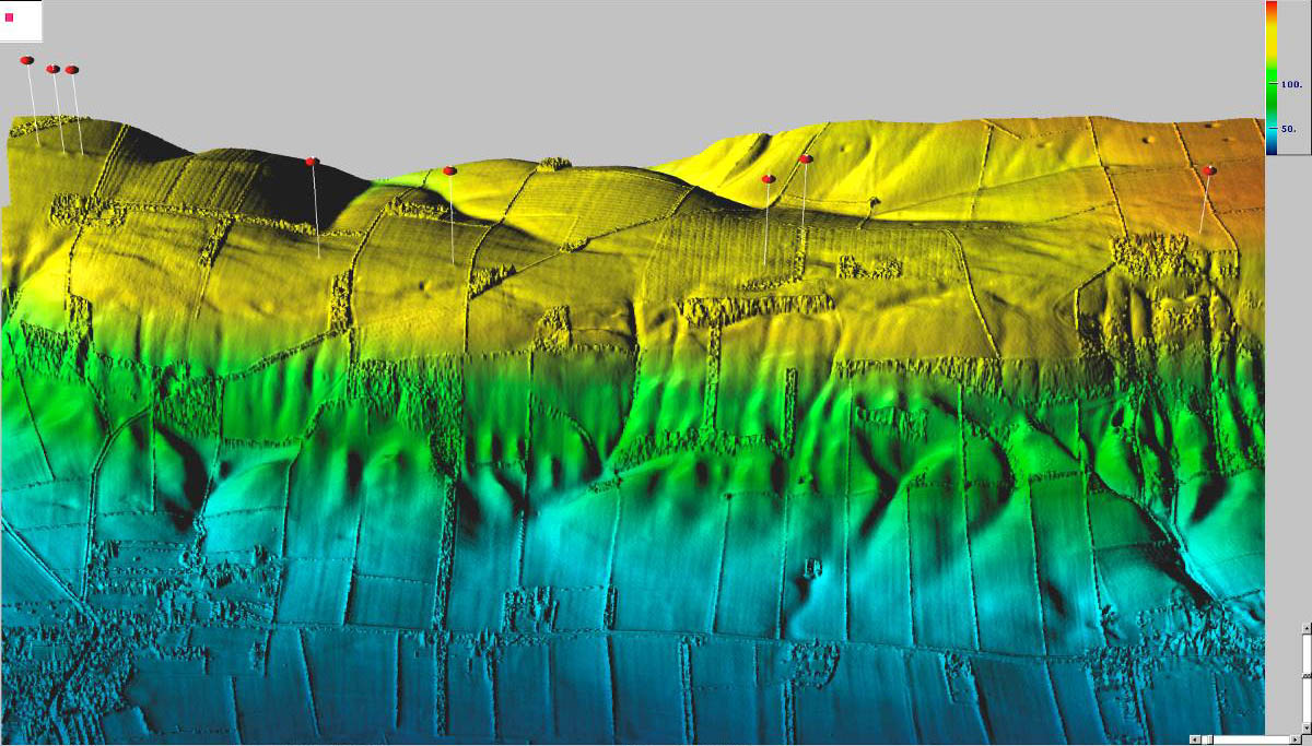
This map shows how beautiful maps can be! This LIDAR image was made by laser rather than using radiowave or microwave radiation. It is useful for getting three dimensional images.


Isopach


This is an isopach map. The colors and contour lines illustrate rock or sedimentary thicknesses. The blue color shadings repesent less thickness, and the red shadings represents greater sedimentary thickness.

Black and White Aerial Photo


Black and white aerial photography has been used for many decades before infrared aerial photography became available. The black and white film has an emulsion on it that picks up light, much like our eye do.

Isoline Map

Isolines on maps are lines that connect points of equal value. All the area on the same line will share the same variable, such as the temperature.

http://www.tutorialsolutions.com/isolines.gif


http://mapmaker.rutgers.edu/355/isoline_schematic2.jpg

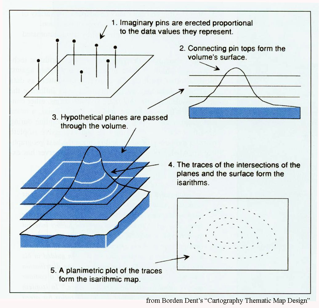
Above shows how the isolines on a map are determined.

Cadastral Map

http://www.iacm.gov.mo/cotaimuseum/photos/exhibits/30.jpg
Cadastral maps show boundaries. They show how land is divided, which is useful for determining and recording ownership.


http://www.fig.net/pub/monthly_articles/may_2008/fig_03.jpg

PLSS (Public Land Survey System)

PLSS stands for Public Land Survey System. It is a type of systematic cadastral map. The principle meridians are equal to the base lines. This is the basis of this system. This map of Minnesota can be found at

http://www.olmweb.dot.state.mn.us/lis/Maps/Parcel_Maps_files/slide0006_image039.jpg