
A Standardized Choropleth map illustrates data that has been areally averaged. The shadings in this map show how many people there are per square kilometer worldwide.


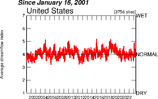
 This index value plot depicts the average streamflow index for eight years for the United States. Being graphed along the normal range shows the fluctuation for the streamflow variable.
 A Climagraph is a map graph that charts temperature and precipitation from month to month. This climagraph records a full year's data for Walgett, Australia. We can determine that the driest month was July.
