
Monday, July 28, 2008
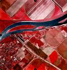
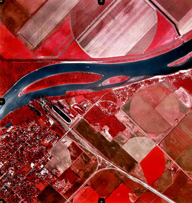
Infrared Aerial Photo
Infrared aerial photos are made with cameras either digitally or with film that is sensitive to infrared light rays. The uses for infrared aerial photos vary from tracking rainfall, to migratory patterns of animals.
Statistical Maps
 Statistical maps show the density where the variable is located. This map represents where metropolitan and micropolitan statistical areas are found in the United States and Puerto Rico.
For a better view of this map, click on the link below.
http://www.novoco.com/new_markets/resource_files/maps_data/cbsa_us_1203_large.gif
Cartograms
Cartograms are like statistical thematic maps. They distort areas according to the variable being represented. This map shows world - wide where deaths occur from easily preventable diseases.


Flow Maps

This flow map shows the truck routes that generate in Texas and go to the rest of the United States. Flow maps show the intensity of travel from one location to another.
http://www.lib.utexas.edu/maps/texas/combtrk_tx_1998.jpg
Proportional Circle Maps

This is a type of point pattern map. Circles get larger as the density of the variable increases. One can see the actual counties shown in the map on the near right, with the darkest counties being the densest, and the lighter counties being less dense. On the far right, the circles show that the larger the circle, the denser the variable, and vice versa.
Choropleth Maps

A choropleth map shows areal data, or data that refers to specified areas. The areas might be defined by different shades of one color or perhaps dots. This is how different areas on the map can be compared.
http://www.cartisan.com/map_resources/map_types/images/choropleth.jpg
Dot Distribution Maps

This map of Wisconsin has dots all over it depicting areas that the mealy rosette lichen thrives. Dot distribution maps depict where something is located. This can imply that an area without dots has no mealy rosette lichen!
http://www.botany.wisc.edu/Wislichens/dots/PHYMIL.gif
Sunday, July 27, 2008
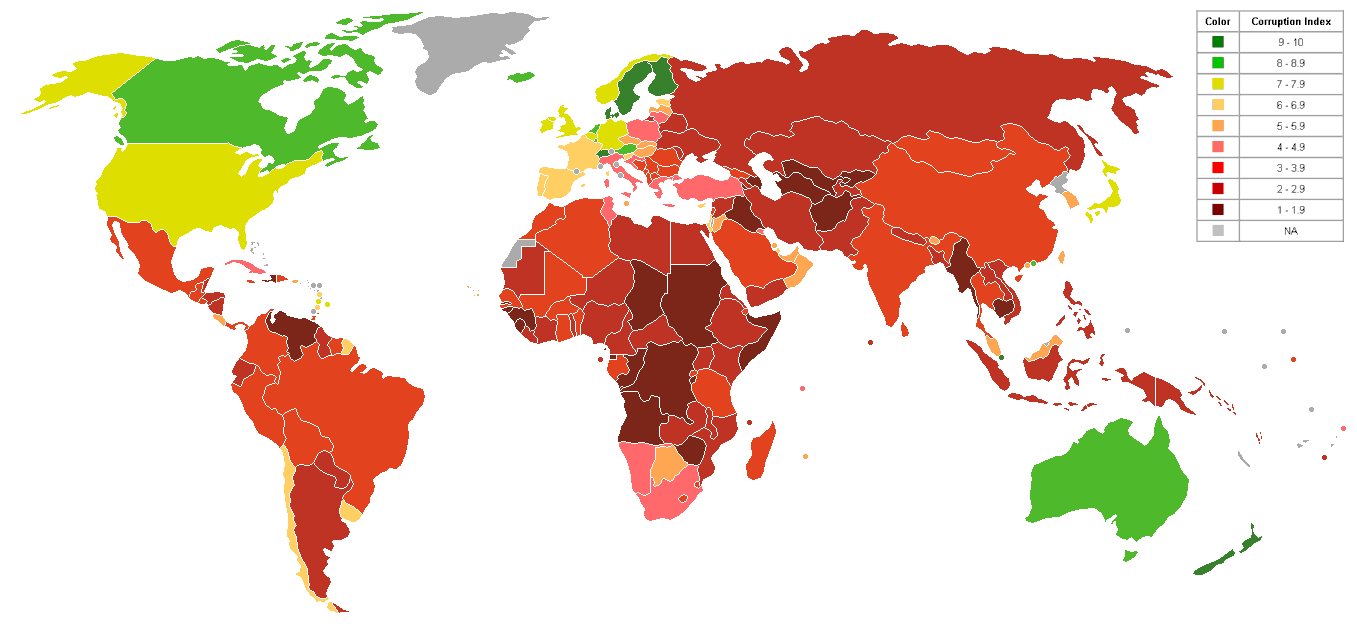
Propaganda

Propaganda is a term used when the recipient of the information is meant to be persuaded by its information. For example, the map to the right is representing propagandistic information with the map legend colors defining corruption. To find which nations on this map are more or less "corrupt" than others, go to:
http://upload.wikimedia.org/wikipedia/commons/0/04/World_Map_Index_of_perception_of_corruption.png
Thematic Maps

Thematic maps display one idea being represented. It might display a region's natural resources, types of industry located there, or how many people live there. This beautiful map represents the natural regions of the great state of Texas. Locate this map and others at: http://www.zephyr-graphic.com/maps/nat_regions/natreglarge.jpg
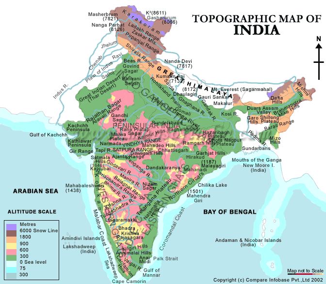
Topographic Map

This is a topographical map of India. Topographical maps represent horozontal and vertical lines. They are different than planimetric maps because they do show elevation. This map of India has a legend that shows a different color for each change in elevation. This map can be found at
http://www.mapsofindia.com/maps/india/map-of-india-physical.gif
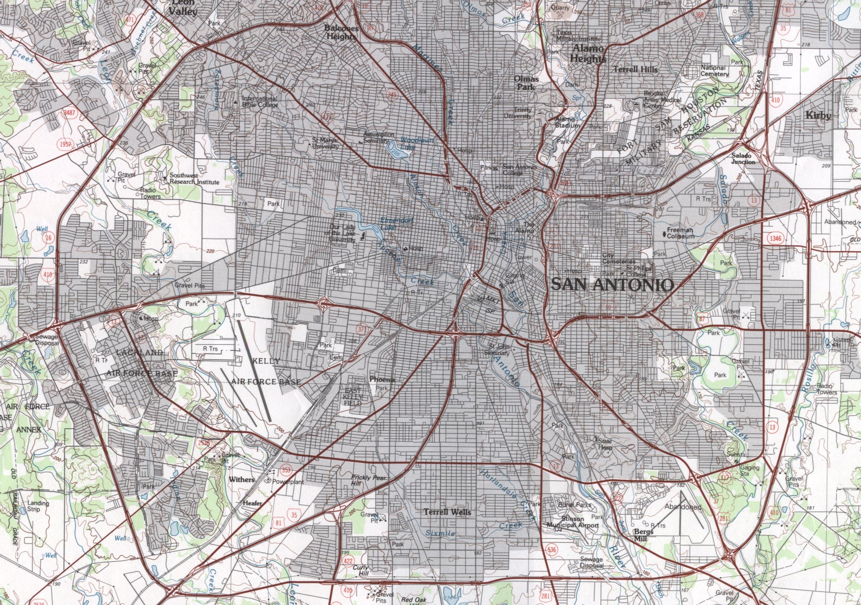
Planimetric Map
Planimetric maps do not show relief. They are often street maps, much like the one below. Planimetric maps do  not show elevations or other data that is not needed. This map of San Antonio, Texas can be found at the URL below.
Mental Maps

A "mental" map is one that stores what the map is portraying inside one's long-term storage of one's brain. It is imagery that one "sees" when words trigger the memory. Books, movies, and even songs can be considered to be mental maps. The image above is an example of a mental map of the world. It was drawn by a student in Thailand.
For another example, I will offer this sentence:
I live in Connecticut.
If one is familiar with the state of Connecticut, perhaps the mental map is one of rocky soil, or beautiful centuries old homes, or even the idea of cold winters. Depending upon what one knows about the subject at hand, determines what the mental map will recall. The image for this specific blog post is stored in each reader's mind. What does your mental map of Connecticut look like?
For a beautiful and informative way to see great examples of mental maps that have been developed with computer technology (geographic information systems), log onto http://mentalmaps.info/ . Sorin Matei has brought what we do not see, into visually representative images.
Subscribe to:
Comments (Atom)